Starbeamrainbowlabs

Stardust
Blog


Archive


Mailing List Articles Atom Feed Comments Atom Feed Twitter Reddit Facebook

Tag Cloud

3d 3d printing account algorithms android announcement architecture archives arduino artificial intelligence artix assembly async audio automation backups bash batch blender blog bookmarklet booting bug hunting c sharp c++ challenge chrome os cluster code codepen coding conundrums coding conundrums evolved command line compilers compiling compression conference conferences containerisation css dailyprogrammer data analysis debugging defining ai demystification distributed computing dns docker documentation downtime electronics email embedded systems encryption es6 features ethics event experiment external first impressions freeside future game github github gist gitlab graphics guide hardware hardware meetup holiday holidays html html5 html5 canvas infrastructure interfaces internet interoperability io.js jabber jam javascript js bin labs latex learning library linux lora low level lua maintenance manjaro minetest network networking nibriboard node.js open source operating systems optimisation outreach own your code pepperminty wiki performance phd photos php pixelbot portable privacy problem solving programming problems project projects prolog protocol protocols pseudo 3d python reddit redis reference release releases rendering research resource review rust searching secrets security series list server software sorting source code control statistics storage svg systemquery talks technical terminal textures thoughts three thing game three.js tool tutorial twitter ubuntu university update updates upgrade version control virtual reality virtualisation visual web website windows windows 10 worldeditadditions xmpp xslt

Pure CSS Gallery

Galleries of pictures are nothing new. News sites, photography portfolios, screenshots of applications - you've no doubt seen one recently.

I found myself with the task of implementing such a gallery recently, and inspired by CSSBox I decided to implement my own - purely in CSS without any Javascript at all as a challenge (also because the website upon which I wanted to put it doesn't yet have any Javascript on it, and I don't want to add any unless I have to). I started with a basic HTML structure:

<section class="gallerybox">

    <section class="gallerybox-gallery">

        <figure class="gallerybox-item" id="picture1">
            <picture>
                <img src="https://placekitten.com/800/500?a" alt="" decoding="async" />
            </picture>

            <figcaption>Caption A</figcaption>

            <a class="gallerybox-prev" href="#picture3">❰</a>
            <a class="gallerybox-next" href="#picture2">❱</a>
        </figure>
        <figure class="gallerybox-item" id="picture2">
            <picture>
                <img src="https://placekitten.com/800/501" alt="" decoding="async" />
            </picture>

            <figcaption>Caption B</figcaption>

            <a class="gallerybox-prev" href="#picture1">❰</a>
            <a class="gallerybox-next" href="#picture3">❱</a>
        </figure>
        <figure class="gallerybox-item" id="picture3">
            <picture>
                <img src="https://placekitten.com/800/502" alt="" decoding="async" />
            </picture>

            <figcaption>Caption C</figcaption>

            <a class="gallerybox-prev" href="#picture2">❰</a>
            <a class="gallerybox-next" href="#picture1">❱</a>
        </figure>
    </section>

</section>

I've omitted the <html><head></head><body><main></main></body></html> wrapper bit to keep this short, and I'm using {placekitten} for nice placeholder images (my placeholder image service is cool, but doesn't generate images that work well in a gallery).

Each gallery item is a <figure> element and has it's own unique id.next / previous buttons are implement with <a> elements linking between ids. By using the :target element, we can apply CSS rules to the element whose id matches that of the anchor element that we've linked to. For example, if at the end of the URL in the address bar there was #picture2, then the <figure> element with the id picture2 would be targeted by the :target pseudo-selector.

The key challenge in a gallery is to display only the image that's currently being viewed, without showing any of the other images. This is trivial with Javascript, but slightly more challenging with CSS only.

To solve this problem, at first I jumped almost immediately to :target-within and did something like this:

.gallerybox-gallery:target-within > .gallerybox-item:target {
    display: block;
}
.gallerybox-gallery:target-within > .gallerybox-item:not(:target) {
    display: none;
}

Unfortunately though, as of the time of typing it's not supported by any browser:

(Click to see the latest Can I Use support table - by the time you're reading this support may have been implemented)

Annoyingly, :focus-within is already supported, but not :target-within. Not to be deterred, I came up with another plan. By using a CSS Grid with only 1 element, we can make all the images occupy the same space on the page, and then use position: relative and z-index to control which one is displayed at the top of the stack to the viewer:

.gallerybox-gallery {
    display: grid;
    grid-template-columns: auto;
    grid-template-rows: auto;
    grid-template-areas: "main";
}

.gallerybox-item {
    grid-area: main;
    z-index: 2;
}

.gallerybox-item:target {
    z-index: 100;
}

It took me a bit of fiddling around to come up with, but it's a wonderful hack that solves the problem. In the future, I'll revise the code behind this to use :target-within, because it's probably much more performant.

With this, we have the basics of a gallery! With a of styling of the captions and next / previous arrows, I got this:

See the Pen gallerybox: Pure CSS Gallery by Starbeamrainbowlabs (@sbrl) on CodePen.

(Can't see the above? Try this direct link.)

The other thing of note here are is the way I vertically aligned the next / previous arrows:

.gallerybox-item {
    position: relative;
}
:where(.gallerybox-prev, .gallerybox-next) {
    display: flex;
    align-items: center;
    height: 100%;
    position: absolute; top: 0;
}

I use a flexbox here along with the align-items directive (which aligns things perpendicular to the main axis of the flexbox) to vertically align the text inside the <a> elements. To make the <a> elements the right height, I use the fact that position: abolute is relative to any ancestor elements that are also positioned with a height: 100% (100% of the containing element's height) to make them the right height.

This post was mostly just to quickly show off the some of the techniques I've used here and this gallery script. It does have the flaw that if used in a long page it causes the user's browser to jump and put the top of the gallery at the top of the page (which wouldn't be an issue if I used Javascript), but that's an acceptable issue given the constraints of the challenge.

If anyone found this interesting, I'd be happy to talk more in depth about CSS in a future post (though CSS Tricks does this very well already).

Pure CSS spoilers with the CSS :target selector

For 1 reason or another, I've been working on some parser improvements for Pepperminty Wiki recently. Pepperminty Wiki uses Markdown for the page content syntax - specifically Parsedown. Markdown has a number of variations and extensions, some of which are more widely accepted than others. For Pepperminty Wiki, I try to stick as closely to existing Markdown conventions as possible (such as the CommonMark spec). Where that's not possible, I try to make sure there's an existing precedent (e.g. internal links use the same syntax as MediaWiki).

Anyway, as part of this I thought it would be cool to implement a spoiler tag. The problem here is that nobody can agree on the canonical syntax. Discord has recently implemented a vertical bar syntax like a spoiler wall:

Some text ||spoiler text|| more text

Reddit, on the other hand, uses a different syntax:

Some text >!spoiler text!< more text

Anyway, I've ended up supporting both of the above 2 syntaxes. My Parsedown extension generates something like the following HTML:

<p>Some text <a class="spoiler" id="spoiler-RSSZTkNA30-OGJQf_7VivKtJAaoNhbx" href="#spoiler-RSSZTkNA30-OGJQf_7VivKtJAaoNhbx" title="Click / tap to reveal spoiler">spoiler text</a> more text</p>

The next question here is how to make it function as a spoiler. If you're not already aware, to reveal to text in a spoiler, one first has to click on it or perform some other action. Personally, I'd prefer to avoid Javascript if possible for this, as not all users have it enabled and it complicates matters in Pepperminty Wiki.

To this end, if you search for "Pure CSS spoiler" with your favourite search engine, you'll find loads of different solutions out there. Some require Javascript, and others only show the text in a tooltip on hover (which doesn't work on mobile). All this isn't very cool, so I decided to implement my own solution and share it here :-)

It's actually pretty concise:

.spoiler {
    background: #333333;
    border-radius: 0.2em;
    color: transparent;
    cursor: pointer;
}
.spoiler:target {
    background: transparent;
    color: inherit;
}

By setting the text colour to transparent and the background to an obvious colour, we can give the user an obvious hint that there's a spoiler that can be clicked on. Setting the cursor to a hand on platforms with a mouse further helps to support this suggestion.

When the link is clicked, it sets the anchor to spoiler-RSSZTkNA30-OGJQf_7VivKtJAaoNhbx, which is also the id of the spoiler. This triggers the :target selector, which makes the spoiler text visible.

Here's a demo:

See the Pen Pure CSS Spoiler by Starbeamrainbowlabs (@sbrl) on CodePen.

The only issue here is that it doesn't support accessibility tools such as screen readers very well. Using a trick I've found on the Mozilla Developer Net, we can do this to improve that:

.spoiler::before, .spoiler::after {
    clip-path: inset(100%);
    clip: rect(1px, 1px, 1px, 1px);
    height: 1px;
    overflow: hidden;
    position: absolute;
    white-space: nowrap;
    width: 1px;
}
.spoiler::before {
    content: " [spoiler start] ";
}
.spoiler::after {
    content: " [spoiler end] ";
}

...but this still doesn't "fix" the issue, because we're only giving the user warning. Not being a screen-reader user myself, I'm not sure whether this is adequate (is there a 'skip' command that allows skipping to the end of the element or something?) and what isn't.

If you've got a better idea for screen-reader users, please do comment below - I'd love to know.

Found this useful? Got a suggestion to make it even better? Comment below!

Using prefers-color-scheme to display alternate website themes

Support for the prefers-color-scheme landed in Firefox 67 beta recently. While it's a little bit awkward to use at the moment, it enables support for a crucial new feature on the web: Changing the colour scheme of a webpage based on the user's preference.

If a user is outside on a sunny day, they might prefer a light theme whilst browsing the web. However, if they are at home on an evening when it's dark, they might prefer a dark theme.

Traditionally, some websites have supported enabling a site-specific option in their settings, but this requires that the user enable an option manually when they visit the website - and has to be reset on every device and in every private browsing session.

The solution to this is the new prefers-color-scheme CSS level 5 media query. It lets you do something like this:

body {
    background: red; /* Fallback */
}

/* Dark theme */
@media (prefers-color-scheme: dark) {
    body { background: #333; color: #efefef; }
}
/* Light theme */
@media (prefers-color-scheme: light),
    (prefers-color-scheme: no-preference) {
    body { background: #efefef; color: #333; }
}

Hey presto - the theme will now auto-change based on the user's preference!

Here's a live demo of that in action:

See the Pen prefers-color-scheme demo by Starbeamrainbowlabs (@sbrl) on CodePen.

(Can't see the above? Try a direct link.)

Current Support

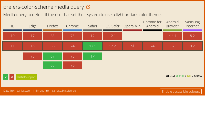
Currently, Firefox 67+ and Safari (wow, who knew?) support the new media query - as of the time of typing. For Firefox users, the preferred colour scheme is autodetected based on your operating system's colour scheme. Here's the caniuse.com support table, which should always be up-to-date:

If this doesn't work correctly for some reason (like it didn't for me on Ubuntu with the Unity Desktop - apparently it's based on the GTK theme on Ubuntu), then you can set it manually in about:config. Create a new integer value called ui.systemUsesDarkTheme, and set it to 1.

If you accidentally create a string by mistake, you'll need to close Firefox, find your profile folder, and edit prefs.js to force-change it, as about:config isn't capable of deleting or altering configuration directive types at this time (yep, I ran into this one!).

Making use of CSS Properties

Altering your website for dark-mode readers isn't actually all that hard. If you're using CSS Properties already, you might do something like this:

:root {
    --background: #efefef;
    --text-colour: #333;
}

@media (prefers-color-scheme: dark) {
    :root {
        --background: #333;
        --text-colour: #efefef;
    }
}

body {
    background: var(--background);
    color: var(--text-colour);
}

(Want a demo? Click here!)

This way, you can keep all the 'settings' that you might want to change later at the beginning of your CSS files, which makes it easy to add support for dark mode later.

I know that I'm going to be investigating adding support to my website at some point soon (stay tuned for that!).

Found this interesting? Got a cool resource to aid in colour scheme design? Found another great CSS feature? Comment below!

Sources and Further Reading

Revolutionising CSS with Grids

(Source: The header of Mozilla's Firefox grid inspector landing page. Mozilla neither endorse this blog post nor probably know that it exists :P)

You may or may not have heard about it by now, but browsers now have support for a new feature of CSS - the Grid. I'd argue that it's the single greatest addition to CSS since it was created, and to that end I wanted to post about it here.

First though, let's look at where we've been, as it will help us understand what's so great about the new grid specification.

In the days of CSS 2, the venerable HTML <table> was the de-facto method for laying out your website - though some websites would use a frameset instead. This worked, but it wasn't very flexible. It also sort of 'abused' the HTML <table> - as a <table> is meant to display data, not provide a tool for layout purposes.

Curiously, I found some educational courses called this an 'advanced' technique for building a website - I certainly wouldn't want a website laid out in a table!

To solve this, we got the float property. With this, we could get things to sit side by side - without having to use a table! This was much better than before, but still not very flexible.

Next up came the flexbox - This is like a sort of 1-dimensional grid - allowing you to set out your content in multiple nested rows or columns. It's certainly worth taking the time to learn, as it's very useful for things like spacing the items in a navigation bar out evenly, for example.

This brings us to the Grid. Basically, it's a 2-dimensional flexbox, but with some added extra features. It's probably best explained with an example image:

The above is a pair of screenshots of a little project of mine (hint: it's related to this) with Firefox's Grid Inspector turned on. As you can see on the left, I can split the page up into multiple discrete parts, and assign different elements to each one. This is known as an explicit grid.

On the right, however, I have simply told it that I want 2 columns, each row must be at least 10em high, and that there should be a 1em gap between cells - and it has worked out that it needs 2 rows in order for every element to have a place. This is known as an implicit grid.

Together, they form a powerful framework for laying out a page. Gone are the days of having a million container elements all over the place confusing things - it is now possible to lay out a webpage with a beautifully flat HTML structure.

(Source: A Complete Guide to Grid on CSS Tricks)

If you're interested in creating a website for your next project, I encourage you to investigate the CSS Grid to layout your page. With browser support like this:

Can I Use css-grid? Data on support for the css-grid feature across the major browsers from caniuse.com.

(Can I Use Embed from caniuse.bitsofco.de)

...there's really no reason not to use it! To get started, I'd recommend checking out CSS Tricks' A Complete Guide to Grid. It contains everything you need to know. If you prefer a more example-driven approach, then Grid by Example also provide a fairly comprehensive view.

(Found this useful? Got a brilliant resource not listed here? Found something even better? Comment below!)

Sources and Further Reading

SVG and CSS

Huge Purple Flowers

Recently someone mentioned that they knew someone else who had just brought a duvet cover that has "Huge purple flowers" on it. This gave me a most interesting mental picture - and I recreated in Inkscape (which has just been updated!) for you to see - the result is shown above. Note that those plants would be at least 3 times your size.

Anyway, I also learned that you can mix SVG with CSS (and Javascript, but I haven't got to playing with that yet). as a test, I created a quick square in Inkscape and then opened the resulting file up in my favourite text editor and plugged in some CSS animations. This is what I came up with:

A simple loading animation

The square above is actually black and set to have a low opacity, to it sets on the colour anything that is behind it. It is also done in percentages, so you can set the width and height of the containing <img /> tag and it should scale accordingly.

I might do some more of this in the future - it looks to me like a wonderful way to create a nice little self contained widget that you can use anywhere.

An (Almost) Pure CSS Spotlight

I made a spotlight demonstration using (almost) pure CSS!

A little bit of javascript is used to make the spotlight follow the mouse. You can also click through the layer in from of everything that makes the spotlight work because of the pointer-events: none; CSS styling rule.

It can be found below.

The (editable!) source code can be found here. A full screen version of the demo above can be found here.

Art by Mythdael